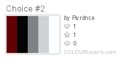
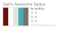
So what do you think of this colour palette for my scrapbooking room? I just happened upon a piece of fabric that I fell in love with from Michael Miller. It's called "Sanctuary Dahlia Lama Seafoam"; or
Should I stick with the black and white damask and possibly a few retro prints? Remember my room is BM's Sundried Tomato! (as seen below). My desk, shelves and table are all white.

Color by COLOURlovers
PS - thx for your help Sara!
Well I guess you will just have to wait and see what I end up with as soon as I finish cleaning up this mess. . .


I absolutely LOVE both of your choices!
ReplyDeleteGail thanks so much for visiting my blog, I really appreciate I have been going back through your posts I sooo love that travel diary /scrapbook so cool!
ReplyDeleteI like the added softness of the turquoise and greys... but the bold black white and red are awesome too.. you can't really go wrong!
ReplyDeleteI am LOVING the blue added in there!!! Even with just a few "hits"!!! I, too am working on my new scrap space... oh the decisions!!!!!! Good luck :)
ReplyDelete